Step 2 - Use Google sheets "MIN" function to find the minimum of the data values in the cells A1 to A2560.
Type the functions "=MIN(A1:A2560)" and press "Enter".

Step 3 - Use Google sheets "MAX" function to find the maximum of the data values in the cells A1 to A2560.
Type the functions "=MAX(A1:A2560)" and press "Enter".

2) The results should be as follows

Step 4 - We start by using a class width equal to 1 and calculate \( N \) the number of classes and their limits. The minimum (rounded), the maximum (rounded) and the class width determined above are used to determine \( N \) as follows:
\[ N = \dfrac{\text{Maximum - Minimum} }{\text{Class width}} = \dfrac{6.994 - 0.027}{1} = 6.967 \]
Round the number of classes \( N \) to the nearest integer \( 7 \).
Start from the nearest "easy to read" value close to the minimum. The minimum (rounded) of this data is \( 0.027 \) and it makes sense to start the classes from 0 in order to make them easy to read when we interpret the histogram.
Write the limits of the classes starting from 0 adding the class width which (abbreviated as CW) is equal to 1:
The lower limit of the first class: 0
Upper limit of the first class: 0 + CW = 0 + 1 = 1
So the first class is: [0 , 1]
Second class is: [0 + CW , 1 + CW] = [1 , 2]
Third class is: [1 + CW , 2 + CW] = [2 , 3]
Fourth class is: [2 + CW , 3 + CW] = [3 , 4]
Fifth class is: [3 + CW , 4 + CW] = [4 , 5]
Sixth class is: [4 + CW , 5 + CW] = [5 , 6]
Seventh class is: [5 + CW , 6 + CW] = [6 , 7]
We stop at the upper limit 7 since the maximum data value is 6.994 and we, therefore, cover all the data values in the set with these classes.
Step 5 - Use the class limits calculated above to write the classes as shown below.

Step 6 - Define the bins to be used in order to determine the frequency of each class. The Bins are the upper limit of each class.

Step 7 - Use the "FREQUENCY" function in Goole sheets to determine the frequencies by selecting an empty cell (G3 in this example) beside the Bins and type "=FREQUENCY(A1:A2560,F3:F9).
NOTE that the cells A1:A2560 contain the data values and the cells F3:F9 contain the Bins values.
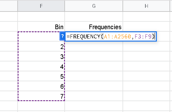
then press "enter" to obtain the frequencies shown below.

Step 8 - Copy classes and frequencies side by side and select the cells containing the classes and frequencies.

Step 9 - Click "Insert" and then "Chart".
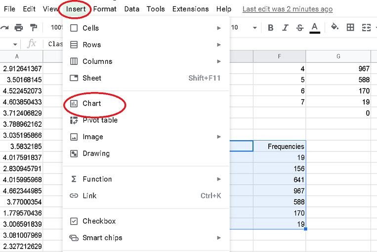
Step 10 - Create the chart by selecting "Stepped area chart".
